19 May 2013

ink & pouring medium experiment

I've had this pouring medium sitting on my shelf for quite a while and finally decided to try it out and see what it does. I used an Ampersand watercolor panel but later realized that it was kind of a waste since the pouring medium doesn't really need the panel's special properties of absorbency and such. However, it was nice to have a clean, white and sturdy surface.

I had a selection of inks to use and decided to dropper the ink straight in; in the future I think I'd like a more subtle look so will try pre-blending the color with the medium before putting it on a canvas.


I had the idea that the medium might dry in a thick layer of I blocked it from coming off the edges, so I got some clear packing tape and made a rim around the edge of the panel. Then I poured a little medium down and put some drops of ink in it.


When I tilted the panel, the ink ran and started to blend in some interesting rivulets, but I could see that I'd need more pouring medium to fill the surface.


So I tried a few more drops of color and added a little more pouring medium. The tape on the edges seemed to be working.


I liked it at this stage, but I had to keep tilting the panel in various directions to cover the whole surface.


By the time the entire surface was covered, the ink had spread quite a bit more and it looked like this. I figured that for a first experiment, this was a good place to stop even though it would be interesting to add more layers. I thought it best that this one dry first.


And I was right because gravity was at work and the pouring medium was seeping out from under the tape in one corner. I lifted the panel on blocks to dry so that the drips wouldn't cause the panel to stick to the paper underneath. I was also curious about painting with these excess drips, but as you can see, when I put a brush through the drops and spread them around they became quite transparent. Also, some of the residue remained in the shape of the drop of the brush itself, which was interesting. It was too sticky for me to feel very comfortable with it as a paint.


Since it was dripping anyway, and since I had the panel raised, I decided to cut the tape edge off and let the medium flow off the edge.


Somehow, in the process of removing the tape, I got bubbles in the pouring medium. I tried to pop one but it only flattened a little. I decided they were an interesting texture and left the rest alone.


As it was drying, I decided to check what would happen if I added some paper to the surface. I cut some yellow tissue paper in tiny leaf shapes (tissue paper because I hoped for some transparency) and laid them on the sticky surface. As it dried, they stuck fast. Also, the surface became increasingly shiny and hard.


I ended the experiment there but plan to try putting on another layer with color already mixed into the medium so I have more control over it. I also want to try perhaps drawing on this layer with a Sharpie and/or putting a collage image down before pouring the new medium on top. I think it could be pretty interesting to create a couple layers that are each sealed in by a new pouring. The transparent nature of each layer could make some neat effects.

I don't care for the glossy surface, but maybe some matte medium as the final layer will handle that? Future experiments await!

28 April 2013

spring blooms & garden notes

"I perhaps owe having become a painter to flowers." -- Claude Monet

Spring is a time of year when I wish I didn't work and could just hang out in the garden, painting the view. I'm so pleased that my irises are starting to bloom, along with just about everything else in my garden. I received a large variety of irises from a friend last fall, planted them and have been hoping they'd be happy and thrive. The one above is one of my favorites and the one below is a new bloom for me called "Hers". All their ruffles and folds remind me of fancy dresses and their colors are inspiring me to paint in watercolor.


I also have the idea to make a little notebook of my irises, marking where they're planted and how the blooms look of the different varieties. I've made some maps of my plantings but keep misplacing them as they're not in a book. The irises that get the morning sun seem to be doing the best, but a botanical drawing book of notes could help me keep track and get them all to do well.

I moved one grapevine to a new location, hoping it would fare a bit better than it has in previous years. In the meantime, the other vine (which has always been the swarthier, more vigorous plant) has shot off in all directions and is sprouting signs of future grape clusters in most promising way. Aren't they cute?


I've photographed the lavender at the end of its bloom, but it's still pretty. I've another variety of lavender that is getting ready to bloom. It's all shoots and buds, ready to spring into color. I can't wait.

I bought a new plant and already forgot its name. If anyone knows what this one is below, I'd be happy to be reminded. It has been blooming for a month now and grows as a tidy, spherical bush. I like the bluish tint to its leaves and the long-lasting flowers.


The azaleas really went crazy while I was on a trip to Oregon, so when I came back they weren't quite as fresh but they're still quite bold. They make this beautiful display every year and light up my courtyard. Since they blossom at the same time as all the roses, it becomes quite colorful.


We'll finish the tour with a quieter plant, the wisteria. She really peaked a few weeks ago, but is still putting on a pretty show. I missed photographing the cascades of blossoms that attracted so many bees a little while ago.


I've been wanting to paint on several canvases that are quietly blank, waiting for me to help them say something meaningful to the world. All the colors and shapes of these blossoms, especially the abstract shapes and negative spaces do inspire!

07 April 2013

mineral pigments


The local art store recently started carrying Daniel Smith watercolors, so I went to their "testing day" to try out some of the new colors. Most of my watercolor paints are Daniel Smith brand, which I like because their pigment is very intense and a little goes a long way with very reliable color. One of the things I was most interested to see was the mineral and rock display that the rep brought along. As you can see above, it wasn't the most organized collection but it was quite interesting nevertheless.

Here's a fuchsite mineral with a wash of the watercolor made from it.


This one is rhodonite - mineral and watercolor.


Rhodonite makes a good color to paint something like these roses, perhaps. (Slipping in another garden pic here!) :)


I enjoyed finding the paint that matched the mineral sample, but it wasn't easy to do since there were tubes scattered everywhere. I really thought the gems were beautiful and interesting since they weren't cut or polished.


Here are some of the colors I checked out. I didn't photograph it, but one of the new colors that I liked best was interference gold. It looked very pretty layered on top of a color, adding depth and sparkle at the same time.


06 March 2013

drawing

I studied drawing long ago at an artist's school on Whidbey Island in Washington State, but now I need to fill in some basic art credits to wrap up my graphic design studies. So, I'm spending my Saturdays in a beginning drawing class and drawing, drawing, drawing. It's pretty fun. I always like the interaction with the other students - chatting and comparing everyone's interpretation and approach to the same subject. I've been quite impressed with some of their work. This one gal who studied art in Korea is really amazing.

The class focuses mainly on duplication, which is not exactly what I hoped for because I feel that my weakness is that I tend to be too accurate. I can get all the angles, sizes and shades right, but I wish I could do that with freer strokes and not lose expression due to all the precision. I think I'd rather have an emotionally strong piece than a technically strong one, wouldn't you? That's what I'd like to work on as an artist.

Precision has its place, of course, and I am enjoying the fact that I'm getting faster at being precise. The still life of the bouquet on the chair seemed to materialize under my pencils, which was quite exciting, and let me tell you, it's extremely accurate. (Boringly so?) ...I enjoyed more the white-on-black drawing of the skeleton where I could play with the texture of the skull, and the free-flowing exercises -- drawing tools with squiggles and one-minute model sketches.

I wish I had completed a singular piece to share with you that I really loved, but that doesn't seem to be the nature of this class. The exercises are useful, but as you can see they're not resulting in incredible art. I can't even share all the work with you because some of it we had to copy parts from famous works, magazines and movie stills, so the art is not exactly original. It's kind of strange to do a class again after all this time. In recent years I've been mostly painting and creating purely from my own imagination and ideas.

Do you artists out there have any drawing exercises that you particularly enjoy? Or was there something you learned that helped you branch away from your usual style? I'd be interested to know!

05 February 2013

hello again


I've finally emerged from a winter hibernation and with the new year already in full swing, I'm ready for a fresh start. But first, I must catch up with the many enjoyable tasks that fell by the wayside while I was reeling from the dismaying clobbering that 2012 gave me. I can only hope those who have been waiting for these projects will forgive my delays; meanwhile, I intend to take the remaining ones up, one by one, until I'm all caught up and ready for entirely new things this (hopefully more gentle) year.

So, an embarrassing number of months later, I'm mailing off the little accordion art book collaboration started by Valeria Poropat in Rome. After the book traveled around Europe, the U.S. and Canada, Jeannine Saylor sent it to me last summer for me to add my page, which I did... eventually. 

I was inspired by a quietly alert deer that I met near Pismo Beach in the woods behind our house. I first noticed the very fresh deer droppings I'd nearly stepped in, then looked up to see huge, soft brown eyes staring at me. It was early in the morning and no one else was awake, just the two of us under the oaks on a quiet hillside. The moment stayed with me, so I added it to this thoughtful collection. Here you can see the work contributed by the other artists:

Valeria Poropat, Tatjana Odovic, Jules Young, Anika Starmer
Lisa Grabenstetter, Jessica Gowling, Jeannine Saylor, Kimi Kobashi
I'm sending the book on to the poetic Thuraya Lynn in Kuwait, who I imagine will add some mysterious black-and-white drawings of sly characters making mischief in their own worlds... we shall see if my guess is close or not!

In the meantime, I wish you all much peace, satisfaction and creativity this bright new year...

xo kimi


06 December 2012

guess who?

I designed two posters recently. Each one represents a different artist/designer. I think they're pretty obvious, but would you like to guess who?

Here's the first one:


Not too hard, hm? Several giveaways in that image.

Here's the second one:


OK, so he's actually an architect but they're designers too...

These were made using Illustrator and took about an hour each. I do like to play with vector art every once in a while -- they were a nice break from the very organic and texture-ridden acrylic canvases I'm working on (that I shall share soon!).

Well, I'm sure that everyone could figure out who these posters represent, but I'll give the answers anyway. The first one is Frida Kahlo and the second is Frank Lloyd Wright. The Wounded Deer is one of my favorite paintings of Ms. Kahlo's and Fallingwater is probably my favorite building of Mr. Wright's. I'd like to go there one day. The closest I've been is to watch the beautifully detailed animation by Eterea Studio.

What other artists would be fun to interpret in poster form?

05 November 2012

book sculptures


I've always loved books, but now I'm falling in love with altering books, folding books, transforming books... All I've done so far is fold them into new shapes and photograph them ~ I haven't even added any color to them yet or experimented with scissors, embellishments or inks ~ but I'm in love with the process and the resulting shapes, texture, and transformation into a new geometry.

It was a little hard to transform my first book, as I've always respected books and tried to keep them from not getting bent and torn. So far, I'm only using old, rescued books that were destined for the rubbish bin. They're actually good books (I'm reading them before I fold them) which somehow makes me more appreciative of their new shapes. 


I'd been admiring Bronia Sawyer's book sculptures for the past couple years and was delighted when she wrote to me about my painted autumn leaves. She's always impressing me with the beautiful and imaginative things she does with books. Some of my favorite works of hers were recently featured on Discover Paper with an insightful interview. As we were talking together, the idea emerged to combine the two ~ books and leaves ~ and share our creations with each other. We wanted to put something together fairly quickly, so the time limit pushed me to get started right away.


With my first attempt, I've come up with a book sculpture still life. I liked the idea that the books are natural objects found in a surreal landscape. I would like to keep pursuing this combination of topics since this is just my first try and I've only barely scratched the surface of the leaf/book connection. Trees/words, leaves/books, paper/bark, poetry/flowers, seeds/ideas... it's quite intriguing!


The folded books have an organic, moody sort of feeling, as though they are cousins to the natural world (and I suppose they are, having their origins in wood, ink and ideas). Perhaps because of the stories they contain, they seem to have a rich inner life and a personal history.

After I folded my first book, I felt such an affinity for it. I carried it back and forth to work with me each day so I could have it near me and think it over. Then I folded another, trying something slightly different, and then another that failed (the book was too old and the pages too brittle). Finally, I folded one more in a taller shape and photographed them all together.

Bountiful Harvest

This book landscape reminds me of a harvest, which I didn't plan in advance but which hit me after I put the books and leaves in front of the big sky. (The background is a photo from our road trip last year, passing through Nevada on our way to Park City, Utah).

I love how dramatic these book shapes are, all on their own. It's fun to give them new settings and meaning. I'm looking forward to seeing Bronia's books-and-leaves combo and will share my next steps into the book sculpture world as I make further explorations!

12 October 2012

autumn leaves by children


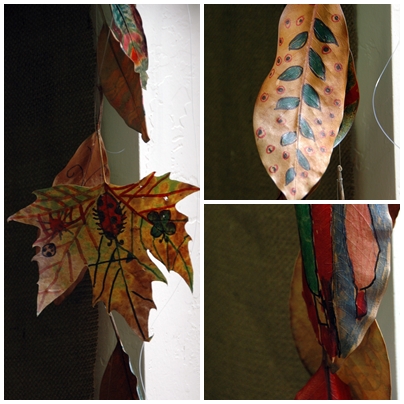
After painting upon my collection of autumn leaves, I shared the idea with my colleague and she had her students gather their own leaves for fall decorations in the classroom. She kept it a little bit easier by giving them Sharpies and even crayon to design their own autumn leaf art.

They hung them with fishing wire, dangling down next to the window. It brings a little bit of the outside in, touched with the children's feelings of fall.

17 September 2012

painting autumn

New autumn decoration on my burlap bulletin board.

At summer's beginning I moved to a new office and became enamored with the magnolia trees that grow outside my window ~ especially the dark, glossy leaves and the unique stamen inside the huge white blossoms that I couldn't help gathering and drawing. Now the leaves are dropping on the paths and they are so beautiful! I picked some up and gave them a little extra color.


I don't know how long they'll last, but autumn is about changes and transitions, so it seems right that the autumn leaf banner I hung may not last too long.


If you'd like a painted magnolia leaf, send me your address at kimikobashi{at}ymail{dot}com and I will make one for you. Hopefully they don't dry too much on the way and arrive crunchy. I'll try to find the freshest dry leaves that I can. :)

Happy Autumn!

10 September 2012

heading somewhere


This weekend I began work on something that has been floating around the peripheries of my imagination for a few weeks. Without being entirely sure what my idea actually is, I gathered supplies and started to put together the skeleton of my creation. As you can see, materialized so far are a set of cotton-candy-colored hills or bosoms, clustered in perhaps a cellular sort of way... and I've only a vague idea where we're headed next.

Some of the inspiration for this project came from a visit to the Triton Museum in Santa Clara a short time ago. A gallery of recycled-art sculptures such as this intriguing portrait ~


got me excited about three-dimensional, textured work. My friend Nita, whose background is in architecture, kept exclaiming as we looked at each piece, wondering how the artist arrived at each of the minute choices it took to create the overall piece.


She got me thinking about how I make artistic choices, and that peaceful, creative zone where one just seems to "know" what to do. Faced with the everyday world of chores and grocery shopping and driving to and fro, finding that mental art space doesn't always come easily, but when achieved it's a real joy. Some of my artworks are for a specific purpose or communication and require some planning and forethought. But other times, as in the project I just began, the piece is more about the process and following the vaguest idea that cannot be seen clearly until suddenly, after hours or days of creation, it suddenly manifests itself in the completed artwork.

While I was at the museum, I admired these pointy pencil slippers by Renee Billingslea. I wonder what the artist's initial starting point was when creating these. Was it a prepared statement? Or did she just have a bunch of pencils lying around and thought of something to do with them?


It's true I had a lot of washi paper. It happened to be in these colors, so that explains the palette, though I painted over the green paper as I didn't care for its shade. I added gold, bronze, blue and yellow. Paper circles from an earlier painting prompted the round shapes to be cut out, but I wanted to sculpt, so they turned into cones. I knew I didn't want to paint on a rectangular canvas, so the idea here is that I'm attempting to create a lumpy, more organically shaped canvas to work on.


I had to sew the paper to keep the cone shapes. I had buttons and beads, some of which ended up on the seams. The buttons worried me a little. I thought they might suggest clothing and suddenly the hills looked like a whole lot of brassieres. But I left them, since the paper beginning is only the start. I think more will happen to these hills and in the transformation the buttons may not be too noticeable.

This other room of sculptures and paintings done by another local artist, Harry Powers, got me thinking that a great way to have art is to make it, and not worry about what it's going to end up being.


It's a bit meditative, sewing painted papers and heading who-knows-where. I'll keep you posted on the passage and we'll see where we finally arrive.


21 August 2012

getaway


This has been one of my busiest summers at work and I really haven't gotten to travel or rest at all, so I was very glad when my husband suggested a trip down the coast for the weekend. We stayed in a little town near San Luis Obispo, not far from Pismo State Beach. The distant horizon, the soft, warm sand, the ocean breeze and sound of the waves were perfect for clearing one's mind and simply being without any rush.


The colors of the sand and sky were so beautiful, and the weather was just right. We saw pelicans and gulls. And we found a number of sea shells.

Our house has a wild hillside stretching farther down than one can see. Long-limbed, gnarled oaks grow back there, sheltering the house and dropping a carpet of leaves. I ventured out there shortly after sunrise and felt like I was in a storybook. I asked a passing deer how old the trees were, but he just looked at me curiously and did not reply. He was surely too young to know.


We packed in as much vacation as we could into one weekend. I played and sang the three songs I now know on the ukulele, we attended a go-kart race in Santa Maria, we walked around the old town area of Arroyo Grande and crossed its swinging footbridge. We tasted wine in Paso Robles, ate fresh bread at the bakery, wandered around San Luis Obispo and deliberately drove around on back roads that we hadn't been on before.

Now I'm back to work, rushing to complete projects and either forgetting to eat lunch or hastily gulping a sandwich at my desk, but I'll keep this weekend with me and take the soft palette of the beach or the vivid strokes of the oak branches and let them come out in my painting one day soon.

Hope you're enjoying these summer days before they're gone!